Hello, Guys.
Welcome to CodeWithWebDev's blog.
In this blog, we will cover the Flexbox Layout in CSS3. We will start with the basics and go ahead with all the concepts.
What we'll see in this blog:
# Basics
# Using Flexbox
# Flex Container
# Flex Items
# Basics
The Flexbox Layout is officially called a Flexible Box Layout Module. The main reason why we have flexbox is its ability to modify the height & width of all its children to fill the available space in all screen-sizes.
Before flexbox, we had to use float or positioning properties which would usually get complicated but now with flexbox, it is much easier to design a responsive flexible layout.
Flex layout is constituted of a parent container known as flex container & their children are known as flex items.
# Using Flexbox
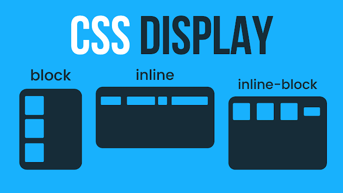
To use the flexbox layout, you can add the display property to your parent element.
When you write display property this also applies to all of its children and they will be flex items.There are many ways in which you can use flex properties but the best way to remember and use them is by making two groups, flex container & flex items. Now, let's see all of these properties one by one.
# Flex Container Properties (Parent)
Let's see all the properties we have for the flex container.
# flex-direction
flex-direction property defines in which direction the container wants to stack the flex items. They can be laid out in two directions either rows horizontally or columns vertically.
Values
- row
- row-reverse
- column
- column-reverse
Default value: row
# flex-wrap
flex-wrap property defines if the flex items should wrap or not. By default, all the items will try to fit in one line, but you can change that according to what you want by using the flex-wrap property.
Values
- wrap: It wraps the flex-items.
- wrap-reverse: It wraps the flex-items but in reverse.
- nowrap: It does not wrap the flex-items.
Default value: nowrap
# flex-flow
The flex-flow property is a shorthand property for setting both the flex-direction & flex-wrap properties.
Values
All the same, values that you can use in flex-direction & flex-wrap properties.
Default value: row wrap.
# justify-content
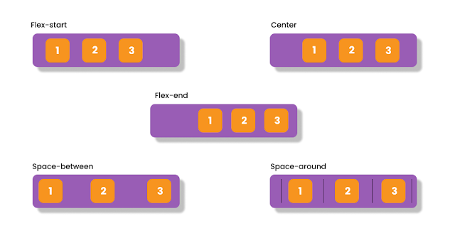
The justify-content property is used to align flex items. It also helps distribute extra free space left over when all the flex items on a line are inflexible, or are flexible but have reached their maximum size. This alignment takes place horizontally.
Values
- Start: Flex-Items are arranged at the start of where we start writing.
- End: Flex-Items are arranged at the end of where we start writing.
- Left: Flex-Items are arranged at the left edge of the container.
- Right: Flex-Items are arranged at the right edge of the container.
- Flex-start: Flex-Items are arranged at the start of flex-direction.
- Flex-end: Flex-Items are arranged at the end of flex-direction.
- center: Flex-items are center along the line.
- space-around: Items are evenly distributed in the line with equal space around them.
- space-between: Items are evenly distributed in the line. The first item at the start & the last item at the end.
- space-evenly: Items are arranged so that the spacing between any two items is the same.
Default value: flex-start.
# align-items
The align-items property is used to align flex items. It also helps distribute extra free space left over when all the flex items on a line are inflexible, or are flexible but have reached their maximum size. This alignment takes place vertically.
Values
- center: items are centered on the cross-axis.
- stretch: stretch items to fill the container.
- baseline: items are aligned such as their baselines align.
- flex-start: The flex-start value aligns the flex items at the top of the container.
- flex-end: The flex-end value aligns the flex items at the bottom of the container.
Default value: stretch.
# align-contents
The align-content property is used to align the flex lines. The align-content property aligns a flex container’s lines within the flex container when there is extra space in the cross-axis.
Values
- center: items are centered on the cross-axis.
- stretch: stretch items to fill the container.
- flex-start: The flex-start value aligns the flex items at the top of the container.
- flex-end: The flex-end value aligns the flex items at the bottom of the container.
- space-around: The space-around value displays the flex lines with space before, between, and after them
- space-between: Items are evenly distributed in the line. The first item at the start & the last item at the end.
- space-evenly: Items are arranged so that the spacing between any two items is the same.
Default value: normal.
# Flex Item Properties (Child)
# order
The order property specifies the order of flex items. The first item in the code does not have to appear as the first item in the layout. The order must be a number.
Flex order can be easily changed without changing the HTML code.
Default value: 0.
# flex-grow
The flex-grow property specifies how much the item will grow with respect to the/relative to the other flex items. You cannot put negative numbers here.
If you have two items, if you put flex-grow for 1st item as 2, then it will take twice the space of the 2nd item.
If all items have flex-grow set to 1, the remaining space in the container will be distributed equally to all children. If one of the children has a value of 2, the remaining space would take up twice as much space as the others.
# flex-shrink
The flex-shrink property specifies how much the item will shrink with respect to the/relative to the other flex items. You cannot put negative numbers here. By default all the items are shrunk, so that all items can take the same amount of space.
# flex-basis
The flex-basis property specifies the initial length of a flex item. It can be any length(%, rem, px, etc.) and accepts width & height, it can also be a keyword such as auto.
Default value: auto.
# flex
The flex- property is a shorthand property for flex-grow, flex-shrink & flex-basis properties. The last two properties are optional. It is recommended to use this shorthand because it sets the other values intelligently and also saves our time as we don't have to write each property individually.
# align-self
The align-self property specifies the alignment of the selected item inside the flex container. It overrides the default alignment set by the containers align-items property.
Values
- center: items are centered on the cross-axis.
- stretch: stretch items to fill the container.
- baseline: items are aligned such as their baselines align.
- flex-start: The flex-start value aligns the flex items at the top of the container.
- flex-end: The flex-end value aligns the flex items at the bottom of the container.
Default value: auto.
Thanks a lot for keeping calm and reading this.
You know what to do and how to proceed.
You can contact me in case of any doubt or if you need assistance.
Let me know your thoughts in the comment section.
You know what to do and how to proceed.
You can contact me in case of any doubt or if you need assistance.
Let me know your thoughts in the comment section.
Follow me on:


0 Comments
Please enter relevant comment's!
Do not spam in the comment's.